Quick Pay
Verizon Prepaid is seeking to simplify the existing payment process, with the goal of improving user convenience during manual transactions on their accounts.
As the UX lead, my role encompassed formulating the complete user experience direction. This involved identifying the key target audience, executing thorough research, evaluating the competition, crafting wireframes, prototyping, preparing comprehensive annotations for implementation, as well as overseeing validation and ensuring quality in cooperation with different team members.
Category
Payments
Teams
AKQA participants
My role as UX lead
Other disciplines that complement the team include visual designers, copywriters, creative directors, business analysts, and project managers.
Verizon participants
Stakeholders
Development team (GTS)
Tools
Figma
Sketch
Abstract
ProtoPie
Keynote
Google sheet
Timeline
3 months
Launched date
Q1 2022
Working process
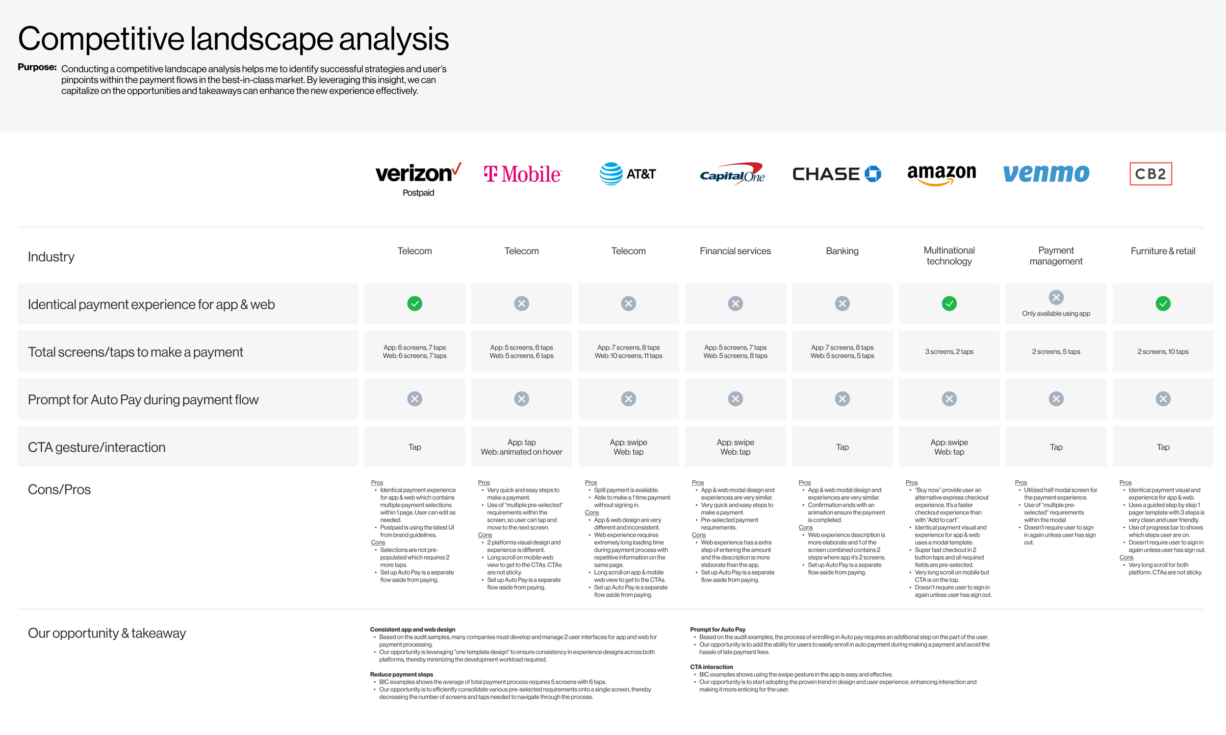
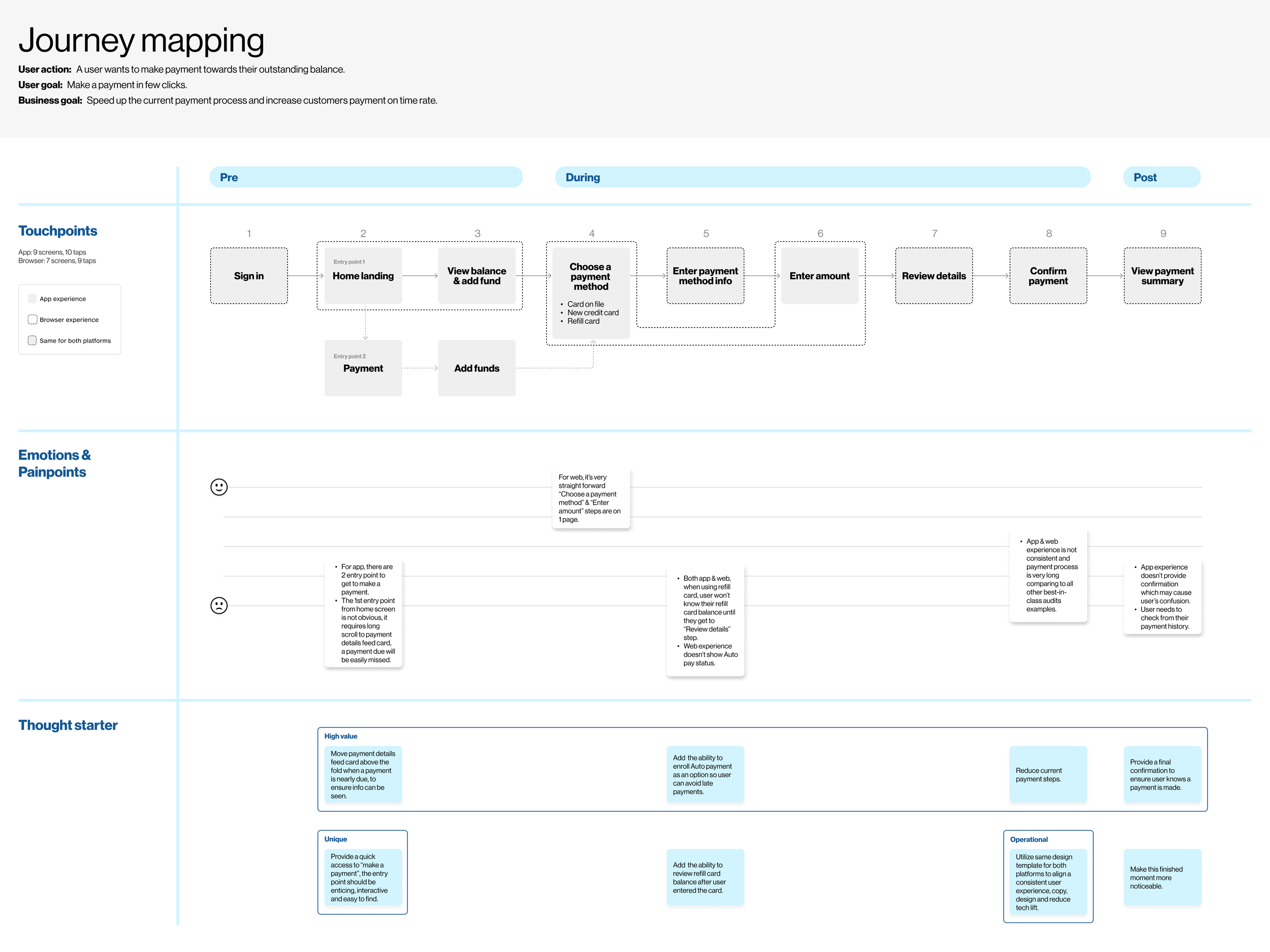
As the project's UX lead, my responsibilities include understanding our main target audience, conducting competitive & landscape analysis to understand and compare with the market trend, evaluating the existing payment process across app & web browser platforms by creating user journeys before beginning the ideation process.

Thinking
My focus is on pinpointing any areas causing dissatisfaction or frustration for users while also recognizing potential enhancements aligned with user needs and the client's objectives.
Key pain points
High:
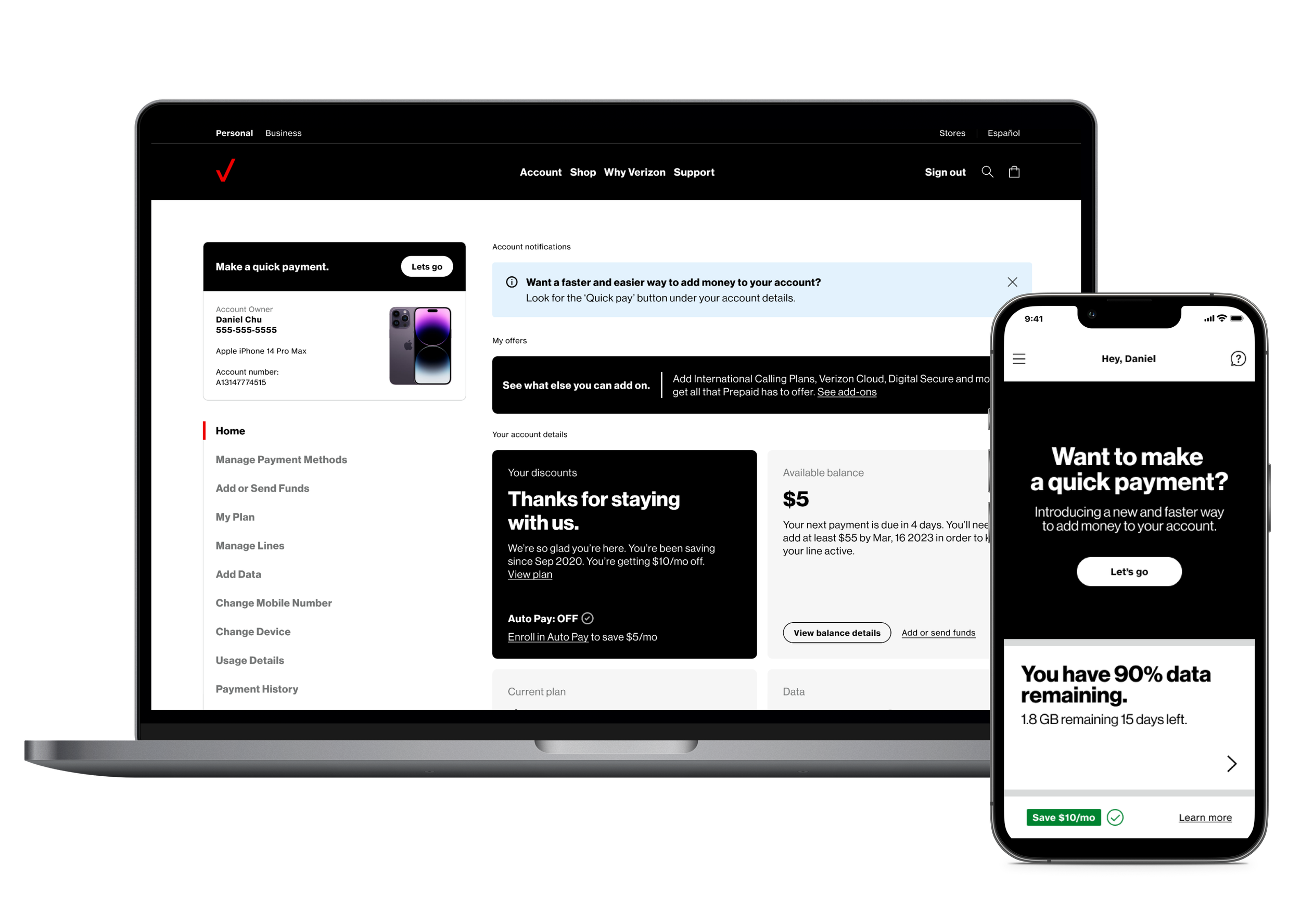
Payment details are hidden beneath other information in the home screen, unless user knows they needs to scroll all the way to the bottom or navigate to view payment landing screen through the hamburger menu within the app.
This makes it easy to miss if a payment is due soon.
Medium:
Browser & app experience is not consistent.
The payment process has too many steps and screens.
Key opportunities
Unique:
Offer a convenient pathway to "make a payment" that is not only easily accessible but also engaging and user-friendly.
High value:
Move the payment details card above the fold as the due date nears for easy access on home screen login.
Enable users to sign up for automatic payments to prevent late payments.
Streamline payment process.
Operational:
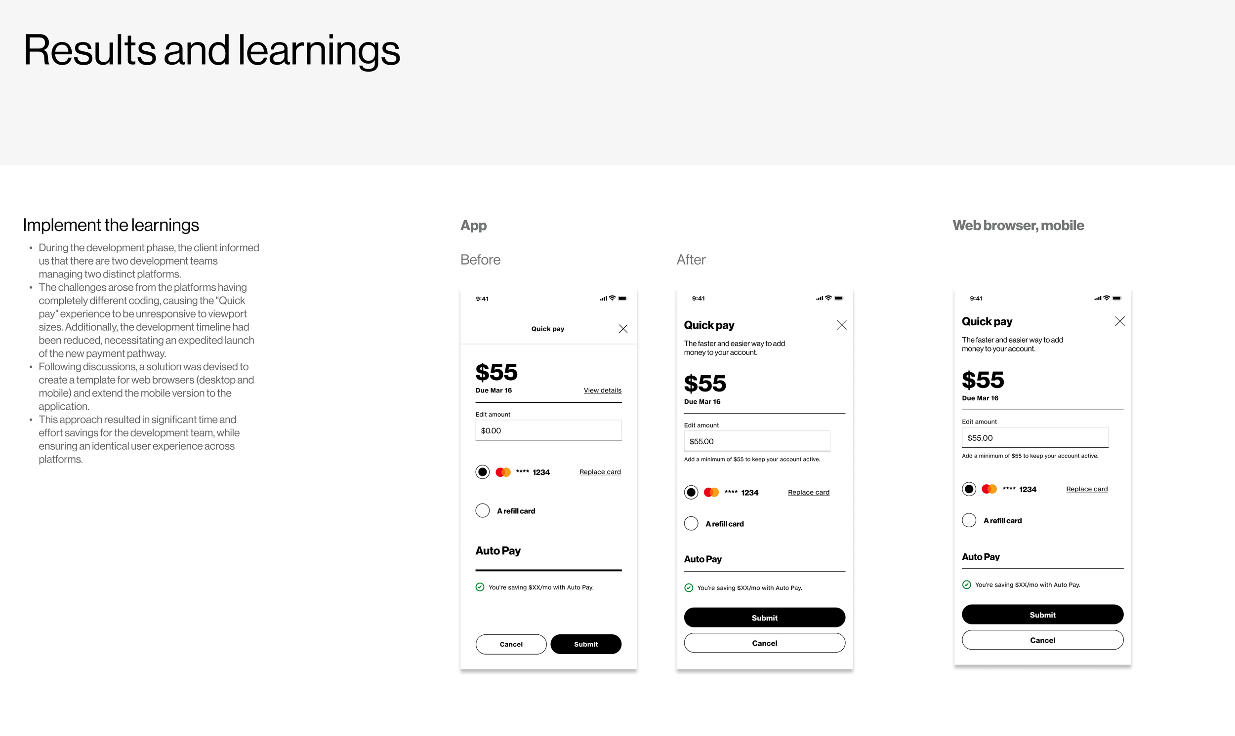
Use the same design for both platforms to keep a consistent user experience, content, and design, and minimize technical work.
Ideation & collaboration
After understanding the user and business’ goals, I carefully identified potential opportunities for improvements by analyzing the current marketing strategies in place. With these insights, I came up with two approaches to enhance and simplify the current payment process. After presenting the initial ideas to the creative team, we collectively decided to proceed with the "Quick Pay Modal" approach. Our team then worked together to elaborate on and advance the overall user experience.
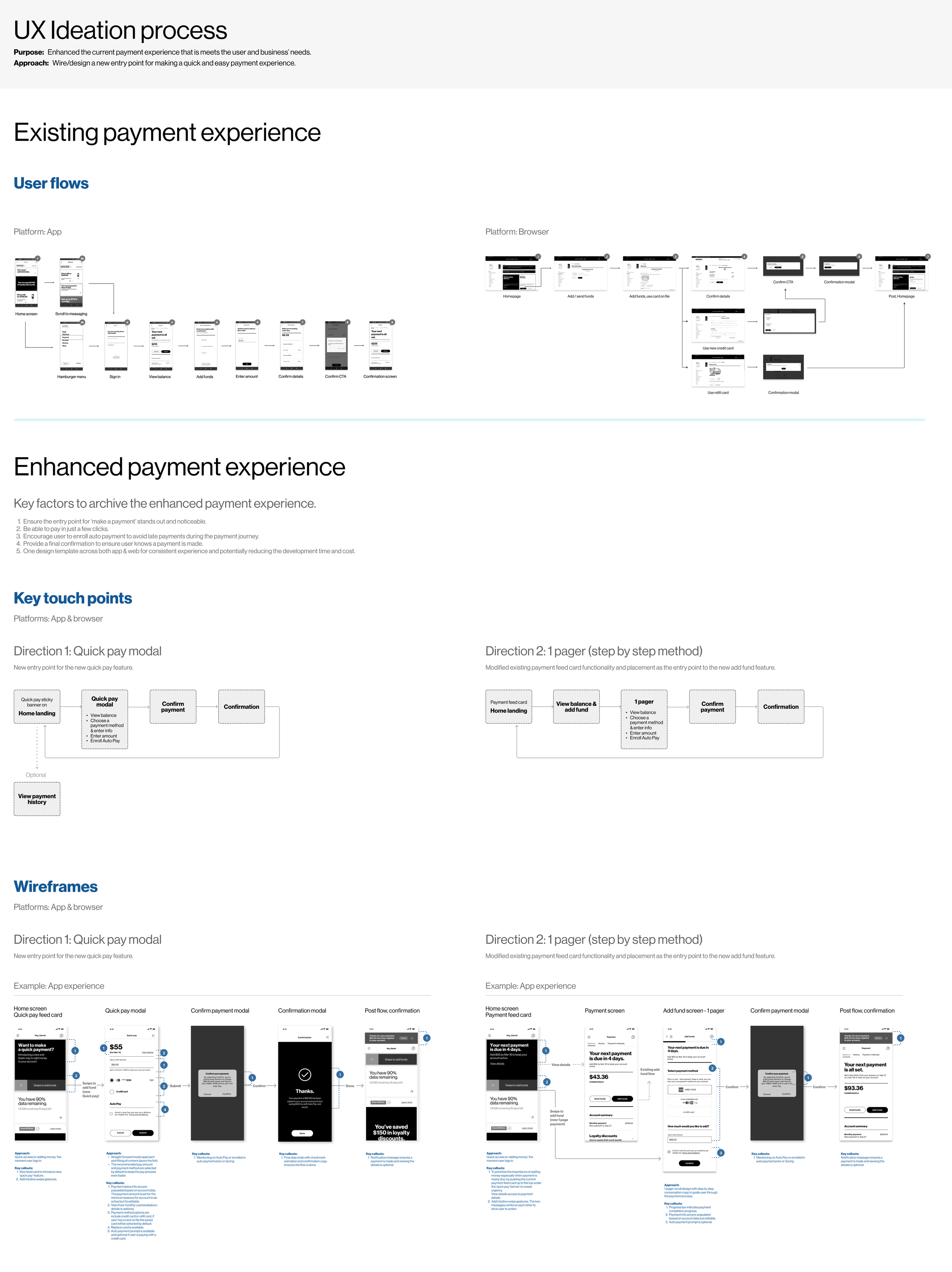
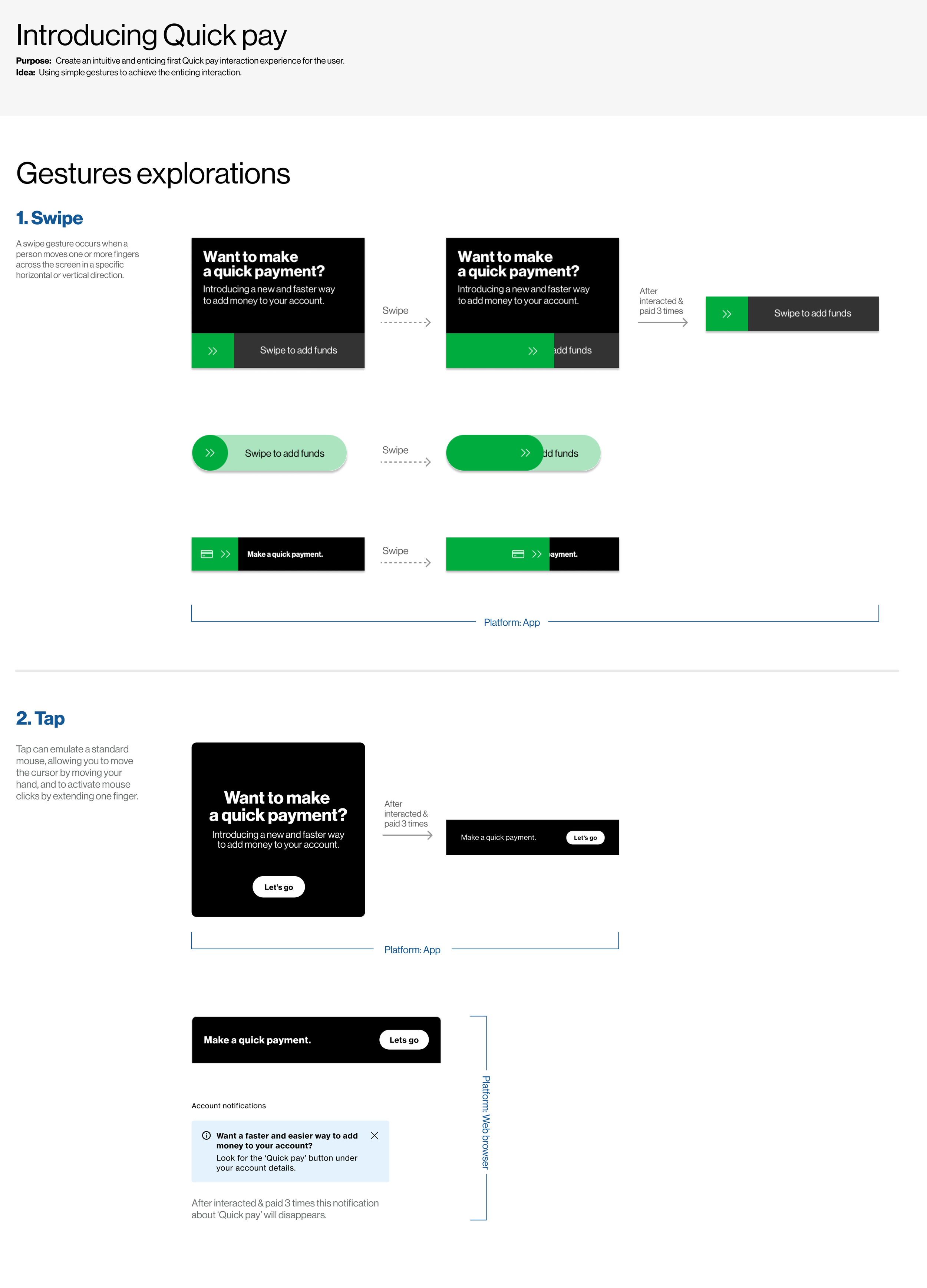
Gestures explorations
With the competitor and best-in-class in mind, we carefully considered and experimented with the gestures of swipe versus taps to seamlessly integrate this interaction into our design. After assessing the level of effort and feasibility of development, we ultimately decided to go with the “tap” interaction for both the app and web browser experience.
Use cases
In my role, it is essential for me to diligently identify all potential use cases that may arise throughout the payment process to ensure its smooth operation.


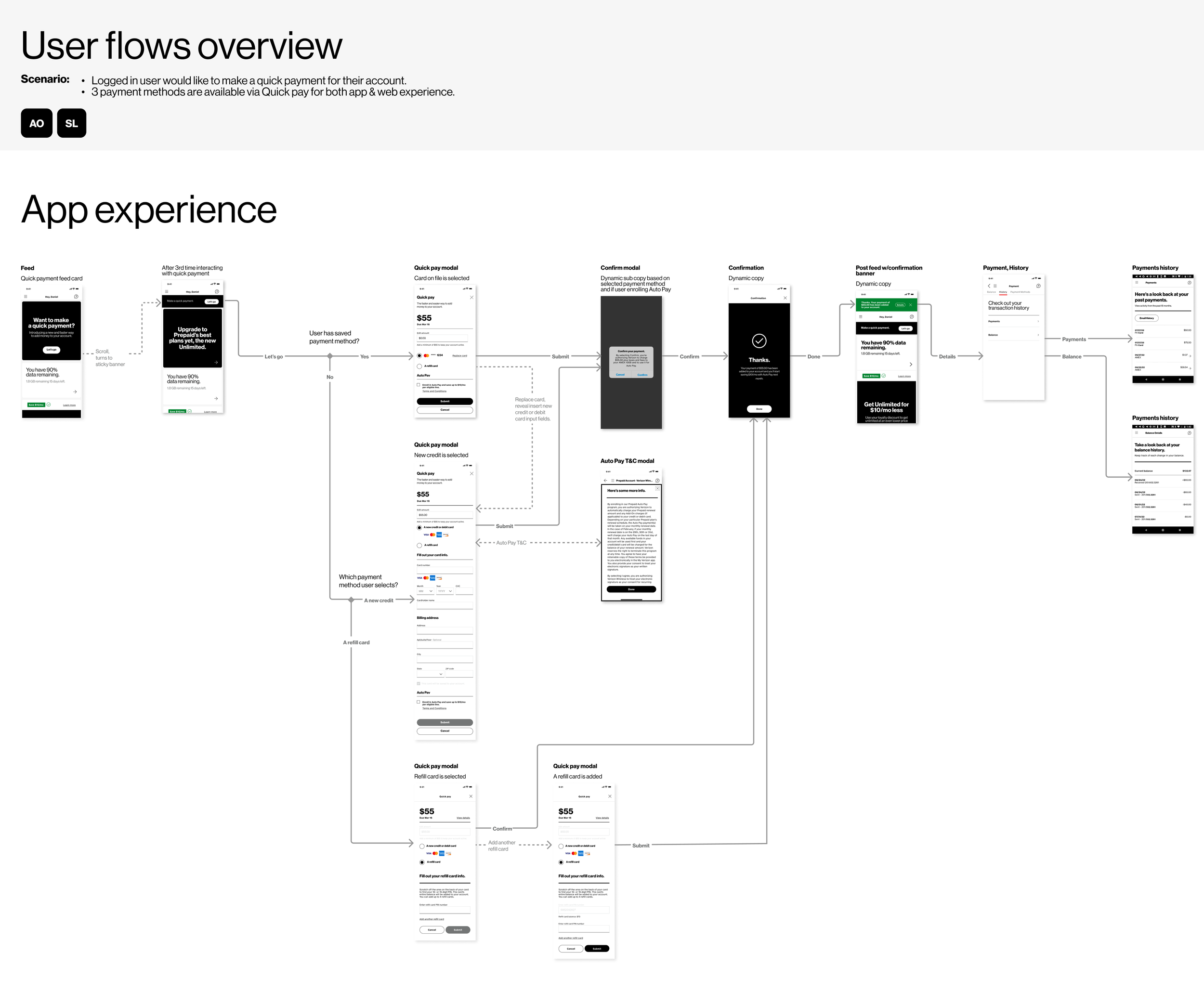
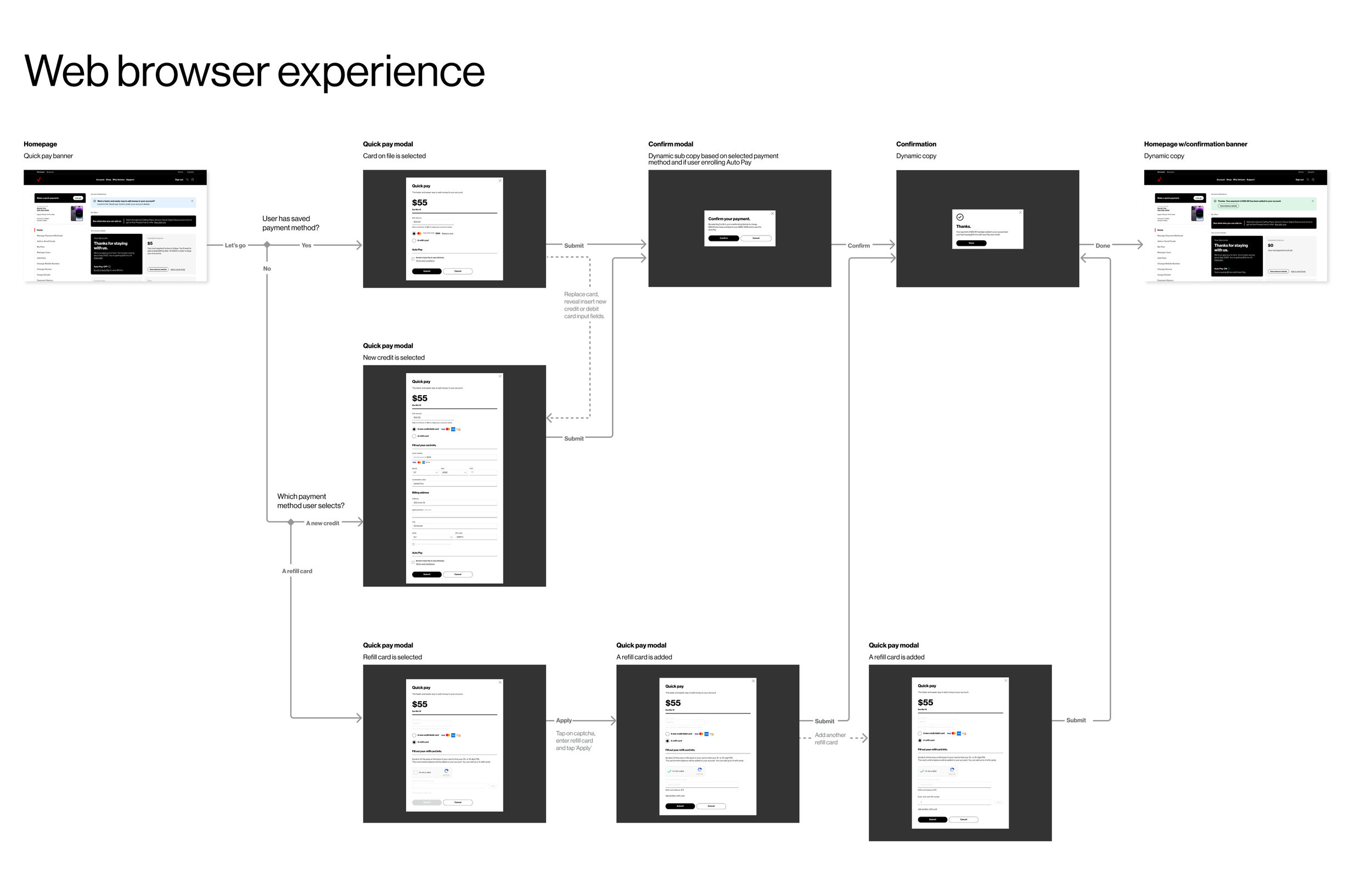
APP & Browser flows
The final design of the app and browser payment paths shines in how it seamlessly connects the user to an end-to-end payment process that spans effortlessly across both platforms. Every detail has been carefully considered to ensure a smooth and intuitive payment experience for all users. It is a collective effort that involves closely collaborating with the AKQA creative team and the Verizon stakeholders, ensuring effective communication and alignment throughout the project.
Video Prototype
An example of the new feature "Quick pay" has been introduced. This feature showcases the happy path when a user already has a card on file and is initiating a manual payment for their account. This enhancement streamlines the payment experience for our customers and offers added convenience in managing their transactions.
AnnotatioN & Delivery
I was heavily involved in crafting the meticulous annotation for client delivery. Below is a sample of a screen annotation illustrating intricate details aimed at ensuring comprehensive documentation and effective communication with business analyst, stakeholders and developers. Additional annotation specifics can be provided upon inquiry.
